Data
Rumour has it... that AAPL stock drops every time a new Apple product is announced or released.
Let's find out if that's true.

Introduction
Apple releases come out a few times every year and I heard a rumor about how every time Apple announces or releases a new product, Apple stock would take a dive because everyone is just really unimpressed with Apple products nowadays. So I thought it would be interesting to study this generalization by looking at Apple stock trends and comparing them to their dates of releases and announcements to see if this rumor is true or false.
Data Visualisation
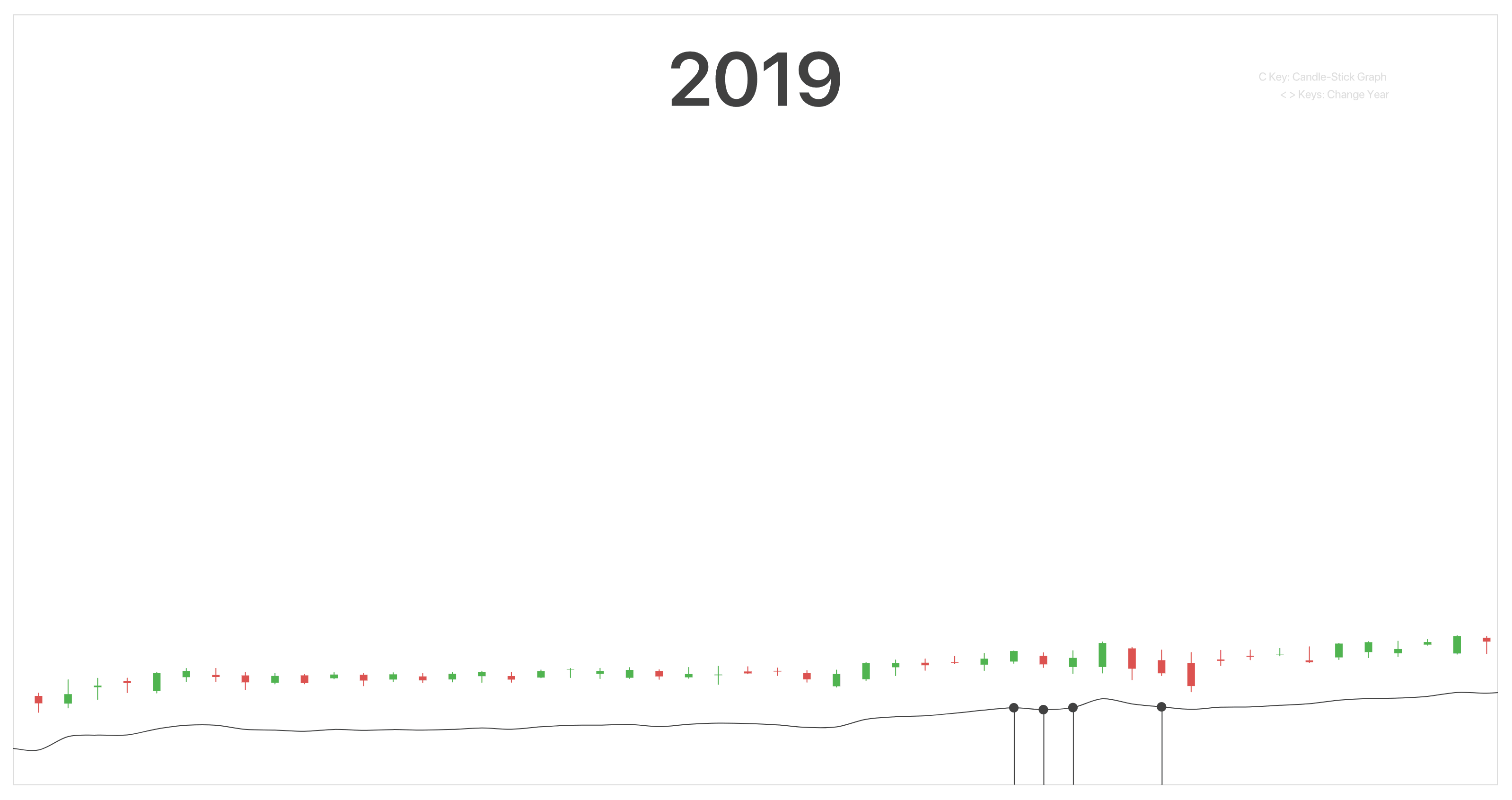
I’ve decided to utilize 3 different graphs for my data visualization, a candlestick graph, a line graph, and a lollipop graph. The candlestick graph is normally used in brokerage apps, encompassing the opening and closing price of the stock and the highest and lowest points as well.
It is a good way to display 4 different comparative numerical information and would help aid in seeing if the response for the particular products announced or released on that day was good or not.
As for the line graph, I feel that it would aid the viewer in showing the up and down trends more obviously of how the stock market does in their normal day-to-day based on the closing price. Lastly, the Lollipop graph represents the timeline of the apple products and each lollipop would state the products that are being announced or released.
The graphs do not reflect any exact stock values because the performance of the AAPL stock in the day-to-day is reflected in the colour of the candlestick graph, which is sufficient in correlating the products announced or released and the performance of the AAPL stock on that particular day.
Findings
Based on the graphs, these are the statistics I found for each year of release. In 2019, there was a tie between good and bad performances for releases and announcements throughout that year, at 8 counts each.
For 2020, there were more good releases than bad ones, at 10 for the former and 7 for the latter. Lastly, this year was not a good year for Apple, out of all the announcements and releases to date, 4 out of 5 performed badly. The one good release was the day that iPhone 13 was available for purchase, however, even the announcement event of the iPhone 13 did not perform well.
Insights
Based on the findings from the data, I think that despite the day-to-day fluctuations in the AAPL stock, these dips and peaks are also largely influenced by the acceptance of each Apple products’ announcement and release.
It could be seen as a popularity score of sorts. Taking the iPhone 13 event as an example, as it is one of the most recent releases, based on a few reviews the Apple Watch Series 7 has been rather disappointing due to the really slight improvements in the make of the new watch. The iPhone 13 itself was controversial and investors were worried that it might be a boring upgrade, thus reflected in the red-colored candle-stick graph on the day of its announcement.
Conclusion
The rumors of all Apple announcements or releases that cause the AAPL stocks to take a dive are evidently false, but it can definitely be seen that these events and their products’ performance are in direct correlation to the performance of the stock market on the day of the announcement or release.
References
- Filipowicz, L. (2021, September 15). The Apple Watch Series 7 seems like a bit of a Clunker. iMore. Retrieved November 10, 2021, from https://www.imore.com/apple-watch-series-7-was-biggest-disappointment-apples-iphone-event.
- List of Apple products. Apple Wiki. (n.d.). Retrieved November 10, 2021, from https://apple.fandom.com/wiki/List_of_Apple_products.
- Ma, B. (2021, September 15). Investors may be disappointed in Apple's iPhone 13 lineup, worry it may be a 'boring' upgrade: IDC. CNBC. Retrieved November 10, 2021, from https://www.cnbc.com/video/2021/09/15/investors-may-be-disappointed-in-apples-iphone-13-lineup-idc.html.
- Miani, L. (n.d.). Apple September event: Disappointing? - youtube. Retrieved November 10, 2021, from https://www.youtube.com/watch?v=ObvpisLQlto.
- Ravinther, K. (2021, October 27). Apple Stock Price (all time). Kaggle. Retrieved November 26, 2021, from https://www.kaggle.com/kannan1314/apple-stock-price-all-time.
- Tech is HARD Podcast. (n.d.). APPLE iPhone 13 EVENT - The MOST Disappointing Apple Announcement EVER? YouTube. Retrieved November 10, 2021, from https://www.youtube.com/watch?v=cltSAceD2ag&t=756s.
- Verma, A. (2021, November 1). Apple Stock Data. Kaggle. Retrieved November 10, 2021, from https://www.kaggle.com/varpit94/apple-stock-data-updated-till-22jun2021.
- Wikimedia Foundation. (2021, October 31). Timeline of Apple Inc. products. Wikipedia. Retrieved November 10, 2021, from https://en.wikipedia.org/wiki/Timeline_of_Apple_Inc._products#2020_and_later.